Nokia revamps its iconic logo for 1st time in 60 years
By MYBRANDBOOK
Nokia has announced its plans to change its brand identity for the first time in nearly 60 years. As the telecom equipment maker focuses on aggressive growth, it has come out with a complete new logo. The new logo comprises five different shapes forming the word NOKIA. The iconic blue colour of the old logo has been dropped for a range of colours depending on the use. While Nokia still aims to grow its service provider business, its main focus is now to sell gear to other businesses.
Besides unveiling a new logo, the brand also outlined how it expects networks to evolve in the next seven years or so, and how it is planning to evolve in line with these changes.
“There was an association with smartphones and nowadays we are a business technology company,” Chief Executive Pekka Lundmark said in an interview.
Lundmark further said that Nokia will focus on adding market share in the company's business by serving wireless service providers with network equipment. The company also plans to review the growth path of its different businesses and consider alternatives, including divestment.


Nazara and ONDC set to transform in-game monetization with ‘
Nazara Technologies has teamed up with the Open Network for Digital Comme...

Jio Platforms and NICSI to offer cloud services to government
In a collaborative initiative, the National Informatics Centre Services In...

BSNL awards ₹5,000 Cr Project to RVNL-Led Consortium
A syndicate led by Rail Vikas Nigam Limited (abbreviated as RVNL), along wi...

Pinterest tracks users without consent, alleges complaint
A recent complaint alleges that Pinterest, the popular image-sharing platf...

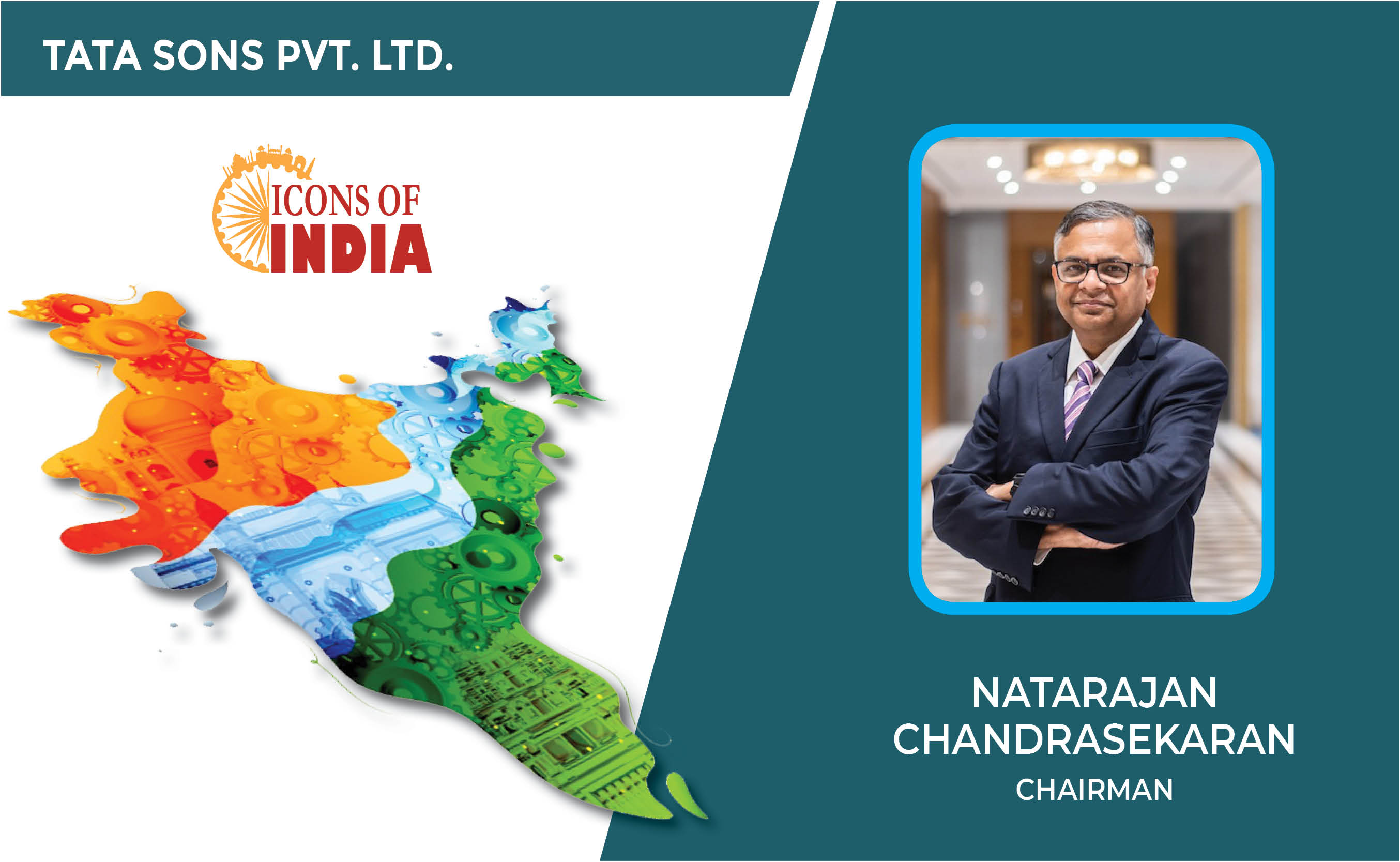
Icons Of India : NATARAJAN CHANDRASEKARAN
Natarajan Chandrasekaran (Chandra) is the Chairman of Tata Sons, the h...
ICONS OF INDIA : VINAY SINHA
Vinay Sinha is the Managing Director of Sales for the India Mega Regio...
ICONS OF INDIA : RISHAD PREMJI
Rishad Premji is Executive Chairman of Wipro Limited, a $11.3 billion ...

STPI - Software Technology Parks of India
STPI promotes and facilitates the growth of the IT and ITES industry i...
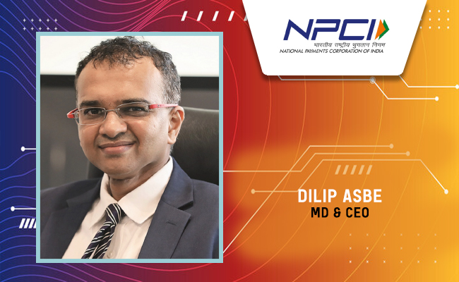
NPCI - National Payments Corporation of India
NPCI is an umbrella organization for operating retail payments and set...
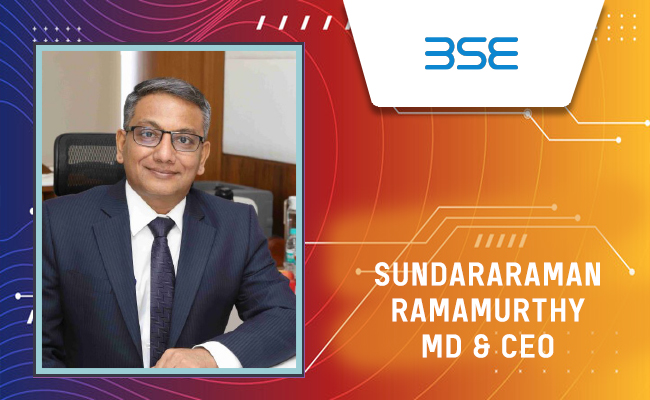
BSE - Bombay Stock Exchange
The Bombay Stock Exchange (BSE) is one of India’s largest and oldest...


Indian Tech Talent Excelling The Tech World - PADMASREE WARRIOR, Founder, President & CEO - Fable
Padmasree Warrior, the Founder, President, and CEO of Fable, is revolu...
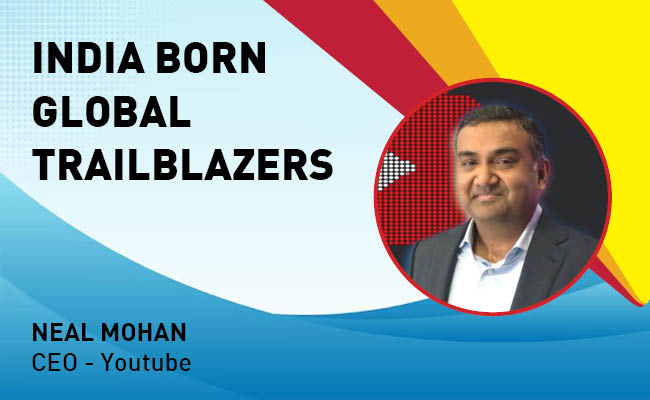
Indian Tech Talent Excelling The Tech World - NEAL MOHAN, CEO - Youtube
Neal Mohan, the CEO of YouTube, has a bold vision for the platform’s...

Indian Tech Talent Excelling The Tech World - Sundar Pichai, CEO- Alphabet Inc.
Sundar Pichai, the CEO of Google and its parent company Alphabet Inc.,...